My last business card ordeal was such a cluster that I’m not even going to link back to that post. Besides, it seems to be getting an inordinate amount of p0rn spam comments and I’d rather NOT help those garner any more attention.
I digress…
I also need a business card and have not been giving this important piece of a business that relies on word-of-mouth enough attention. I was pondering new designs when I came across an artist who does letterpress artwork. I posted his work on a forum I frequent and got offered an excellent deal on letter pressed business cards. I immediately went to work on the design and came up with this:
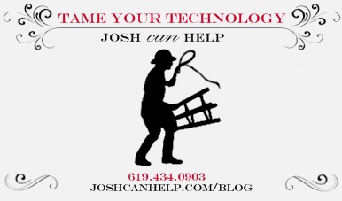
I was digging it but the printer said that each extra color was an extra plate and would cost more. The printing was already more than I wanted to spend so I went with all-black:
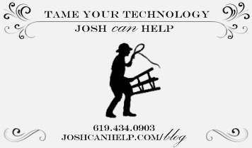
I was really enjoying the design and loved the “old design for new techology” meme. I liked it so much, I posted it on the forum where I met the printer. It didn’t meet with quite the same approval as it had in my brain. Here’s what was said (verbatim):
My eyes are drawn all over the card and can’t find any focus. The font/italics aren’t very good and seem amateurish.
I like the card, but it makes you look like a lion tamer or animal trainer not a tech guy. Maybe have him using the chair and a whip on a PC? That is if you are going to stick with the original idea… And the accents that are on the corners, I would change it to one continuous border, have it just on the top and bottom make it look a little busy.
it’s just hard on the eyes. One more thing… you do look like a lion tamer. My suggestion is to go with the motion of the wheel and not try to reinvent it.
As for the 1920’s circus theme.. It can be done, however I think you missed the mark. To me, frilly script fonts, and borders don’t say “circus” to me. I’m also not making the connection between circus and technology. I’ll also add that your message “Josh Can Help” also does not fit with a circus style theme.
Ouch! I was convinced that no-one really understood where I was coming from with the design but I knew that these people had piles more experience than I do and there was very little that they were liking about it.
I was taking it personally and that is the worst way to try and learn anything. So I read and re-read everything and came up with a few more toned-down versions. For the record, I still like the first one the best.

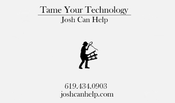
These look cleaner and more toned down but, in my opinion, they were starting to lose character. I realized that the “look” I was going for was, more or less, only in my head.
Well, the wolves liked these much better…
If “Josh Can Help” is your company name, it should be the most important element on the card, and your tag line should be secondary. I’m still not feeling the overall style / idea, but I figured I’d point that out.
The simple ones are an improvement. I agree with the above poster, the company name should stand out the most. I’d also make the tamer bigger since there is so much room in the middle.
Try Vertical. Take the logo, or graphic, put in on top of the card with the ornate corners top and bottom. then imprint the rest below the graphic. seriously, try vertical. see how it looks.
Hmmmm…. then, a little more encouragement (the only reason I didn’t scrap this and start over):
I think that most people on this board don’t quite get letterpress printing… I personally like the approach you’re taking, talking high tech with low tech works for me…. and the lion tamer graphic works too. Letterpress with the right stock is a really nice tactile thing… and a classic serif font is a must for it. Sans serif with letterpress would be a waste of the extra money for print. You might as well print them thermographic instead if you go that way. The only change I would suggest is to have the graphic in the top half of the card and all the text below it. The script font was ok, but not great, given the context you’re aiming at for the design, you likely wouldn’t have seen a single word in-line in a script in a sentence, a true italic, yes, but not a script. Now if you were to take the card vertical and do one word per line stacked and larger with tighter leading, some caps as well, then it would work. I hope this helps.
With this new information, an idea to rotate it to vertical, and a few kind words, I came up with this:
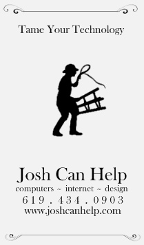
I was REALLY liking this, much more than my original design, and it was very “letterpressy.” The forums went wild!
That one looks very good. I like the changed orientation and the subtle ornate borders. I would work on the font for Josh Can Help. Something a bit more exciting and antique.
my thoughts exactly. looking much better!
I was thinking about a different font as well and also wanted the text to be aligned on both sides (justified). It also needed to be in a vector format (Illustrator). I was scared to work in Illustrator (I’ve opened it five times since I bought it) but I found a few tutorials that helped and came up with the final version minus decorative elements:
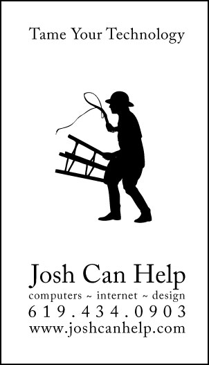
The dimensions are a bit off and it’s not perfectly centered but the font, leading (space between lines), tracking (space between letters), and text are all finished.
What do you think?
Edit: final design getting printed:

< Take Action >
Comment via:
Subscribe via:
< Read More >
Tags
Newer
Jul 21, 2008
Blogging 101: How to Write a Great Blog Post... a Reader's Perspective
By posting a great piece of advice or a guide for someone or your professional insight, you contribute to the incredible equalizing power of the internet.
Older

Jul 14, 2008
Want to self-publish? My review of Lulu.com
I liked Lulu the best from my research and chose them to publish my client’s book. Here are my impressions about the whole writing, publishing, and uploading experience.