This is a guide I wrote several months back. I have it posted on my homepage and at Squidoo but my homepage is going away in favor of a much simpler system so I wanted to move this. It’s also a bit more visible here, where I’m getting hits, rather than on the homepage, where I’m getting no hits! FYI, I also added a new, very important step (#5)…
This guide is for anyone and everyone who knows little about fonts, typefaces, and document design. This small primer serves as either an introduction to typography or all the information you’ll ever need to know as a non-designer. Whether you’re a teacher trying to deliver curriculum the best way you can or a CEO writing a formal letter, you should understand what fonts and styles say about your document and how to use them to your advantage.
I’m going to start this guide off with a warning: don’t dig too deep. Take what I say in this guide at face value and proceed no further. The art of typography is a complete mystery until you take that first step, read that first blog post, and fall deep into an obsessive-compulsive well. Before long, you’ll be second-guessing everything you thought was true and wondering if maybe, just maybe, you could try your hand at designing a typeface. Trust me on this one; take the relatively minute but very useful information that I’m giving you and leave it at that. You’ve been warned.
Who cares about typography?
The only people, ultimately, who care about the typography you present are the readers that are subjected to your work. I realized this after receiving a TERRIBLY designed assignment in class and wondered what that woman was thinking. I have seen the gamut of documents over the years and it’s more often than not that someone goes outside of the “safe zone” of Arial and Times and pulls it off well.
Am I implying that there is no hope for the design challenged? Not in the slightest! That’s what I’m here for… Josh can, after all, help.
We’ll walk through the (very) basic vocabulary of type and show you a few ways to add some personality to your documents without going overboard. I’ll show you some simple ways to make that PowerPoint presentation shine without losing control. I’ll also show you a few places where I get my fonts and a great link for taking that next step.
Step 1 – Write your document
There are people who write, there are people who design and then there are people who do both. If you are on one side of the fence or the other, you have somewhat of an advantage. By focusing on just one aspect of document creation and functionally ignoring the other, you can put all of your energy into that one task and really make it shine. If you do both, however, you might feel pulled in two directions at once and end up stuck and frustrated. It’s an ancient battle: content versus design.
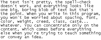
In order to counter the tendency to multi-task, restrict yourself to one task or the other. Instead of writing your content in the design program (whether it be Word, PowerPoint, or your HTML editor), write your content in the simplest form possible. In Windows, try Notepad, the stripped-down text editor typically found under Start Menu > Programs > Accessories.

As you write, keep an outline format in your mind. If the project is a simple paper or letter, there is not too much to be concerned with (header, footer, salutation, sign-off). If, however, you’re constructing a how-to document or a multi-section presentation, you want to make sure you indicate headings, sub-headings, and/or sections. You’re not allowed to determine the look (yet) but you can make notes (say, labeling the headings with “h1,” subheadings with “h2,” etc) that will help you construct the document in the next step.
** Of course, make sure you save your document in this format. Not only do you want to keep all of your hard work thus far but this will also make it easy to move the text into several different programs and/or formats in the future**
You might wonder why I called Word a design program. Word is there to make your text look good and format it to the nth degree. I’ve been using Word for many years and I’m STILL figuring out how to use half of its functions. When I write in Word, I’m always futzing with the settings and the look of the document as I’m writing the document. When I write in Notepad, I’m not allowed to do any visual modifications during the creation so I stay in one train of thought.
Write first, design later. Your final product will reflect your focus segregation.
Step 2 – Add to your design program and choose an outline format
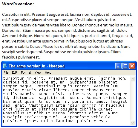
Once all of your text is written down and edited as best you can in whatever program you’re using, now it’s time to place it in the program you will use to modify the design of the document. Notepad or any other text program that does not format your content is great for this step because you won’t be adding text embellishments to baseline formatting. When you copy from Word back into another Word document, there are two sets of formatting that the program can use. When you copy from notepad, there is only one.
The easiest way to do this step is just to copy the original text from your text-editing program and paste it into the design program. This is actually an interesting step for those who are unfamiliar with the difference between formatted and unformatted text. Take note of what changes were made after you have added your text into the new program; you might be surprised.
The first thing to do now that your text has been added is to take the notes regarding sections and divisions and start thinking about what you want to do with them. Don’t make any alterations quite yet; you want to make sure you keep a holistic mindset as you go about this task. You want to preserve the flow of your document and use divisions to move it along. Each section is not a separate document with different formatting; they will each be a different idea building towards your main point. We’re not talking about fonts and bolds and italics just yet, only the structure.
If you’re writing a document for a website or a blog, the end product will not be a “Word document” or a “PowerPoint presentation.” Whether you write your websites directly in text or you use a different program like Dreamweaver or Nvu, I still recommend formatting your document in a word processing program. You want your final product to look polished and it is much easier to quickly edit the style in a word processor than it is in HTML. Write your doc, format and style it in a different program, then add the unformatted text to your web design program and make the appropriate changes there. It is a few extra steps but your document will look better and, in the end, you will save time. Oh, and the spell check is pretty handy too.
Step 3 – Choose and add section styles and list elements.
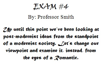
For this step, you’re just going to concentrate only on the headers of the document (the titles for your PowerPoint slides or the names of the different sections for your how-to guide, for example). Change the whole document to a basic font (I recommend Arial) and make sure your headings are separated from the rest of your text (meaning a line/break in between them so you can differentiate it visually). Also, make sure that the page dimensions you are working with match the final product. Set the margins of your document to give you the correct width of your final product (this is more important for web documents where there may be width constraints on the page).
Now, start playing with sizes and weights starting with the main headline. For this document, my main heading is the title, “6 steps to effective typography in any document” so I changed this to 18 point first to see what it looked like. Once that size looks about right for the rest of the document (meaning that it stands out but doesn’t dwarf the rest of the text), I’ll start working on the next headline, in this case “Who cares about fonts?” I changed it to 16 point but it looked too similar to the main headline so I changed the main to 20 point. Now, the differentiation between the heading, subheading and main text looks right. Another option would be to drop both sizes down one step and add bold to both.
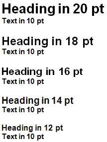
If you’re working with sub headers, sub-sub headers, and sub-sub-sub headers, you may find that your main heading has to be enormous to differentiate itself from the rest. This might be a case of over-organization on your part and it might be time to look at how your document was built. Ask yourself: are all these headers necessary? Can some groups come together? Are the triple-sub-headings coming before 2 or 3 sentences? Sometimes visual styling a document can call attention to possible shortcomings.
It’s important to note something here… especially before we get into picking fonts. Aesthetics is a study of relativity. For example, I find myself perpetually confounded by the direction that fashion trends take. I also find it hard to believe some of the ways people decorate their homes. This does not, necessarily, make them aesthetically challenged; it speaks more to how relative taste is. Good typography, in its most basic state, is making something readable and inoffensive. In its most complicated, exciting state, typography is making words come alive and making them say something beyond their tacit definition.
If you are working on a classroom presentation, a business proposal for executives, or any other document that might reach a broad audience, concentrate on readability and organization. A document that no one wants to read (or can’t read) is not a great trade-off for expressing your creativity. I’m sorry to break it to you, but that’s the truth. I’ll let you take a minute.
After headings, play around with numbered or bulleted lists if you have any. My rule is this: if you’re going to call attention to the amount of items on the list or they are in some kind of order (importance, chronological), make them numbers. If it is just a list, go with bullets. As for lettered lists, I don’t use them too often but, when I do, the list usually falls between numbers and bullets – the items are in some kind of order but their rank is not important.
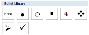
(Can you tell which one of these I would recommend NOT using?)
At this point, your document should look almost completely presentable, if potentially boring (remember: boring looks for a document is not always a bad thing). Next, we’re going to chose a font and line spacing. Yay!
Step 4 – Pick a font and line spacing
Ok, here’s the tricky part, picking a font that works. Here are the basic rules:
-> No more than 2 fonts on a page for your main content. Using 3 or 4 different fonts can quickly lead to a cluttered, ugly feeling to your document or web page. Please, however, experiment to your hearts delight; rules are made to be broken. The more you play around, the better you will understand the K.I.S.S. mentality.
-> Serif fonts (fonts like Times and Georgia that have the lines at the ends of the arms and stems of the letters) are generally easier to read for long periods than sans serif (fonts like Arial and Verdana that do not have these marks). Pick up a novel and you’ll see why. Be careful when mixing serif fonts with sans serif font; it can be VERY dangerous. It can also, however, set them both off. Again, mess around to find the balance.

-> If you’re not sure a particular feature you added looks right and there’s no one else to check with, try something different. Typography just feels/looks right when it’s right. Trust your gut.
-> Keep your final product in mind. If you’re designing for the web, you have a very limited number of choices. I check this list at Codestyle.org out before I start picking fonts to make sure that what I’m using is common. Remember, web documents can have a whole list of fonts to pick from so pick two or three that you can live with.

If you will be sending the document to other people electronically for them to edit, they will need to have the same font you are using or else their computer will pick something else completely. If you are printing the document out or intend to distribute a final copy electronically, you probably want to convert your document to a PDF to retain the styling you worked so hard to achieve. My favorite PDF convertor is CutePDF and can be found here at Cutepdf.com for free. Very simple to use and consistently makes great documents.
In your document designing program, start with the fonts you have installed on your computer and see if any of them tickle your fancy. Look through that whole list and try a few of them out. Make sure you are applying to all of your text at once, including the headers. For all possible choices, look at the document a few different ways: try zooming in and out or changing the line spacing. Also, some fonts can be a bit bigger or smaller so you may need to change the size by a point or two.
what you want to look for is a font that not only stays legible but also one that communicates a particular message. Technical documents and how-to guides look great in Arial and Verdana but also try Arial Narrow or Trebuchet MS. Letters or stories look good in basic Times New Roman but experiment with Palatino Linotype or Bookman. If you’re not finding exactly what you want and the final version of your document will be set (meaning a PDF or printed out), check out some of the fonts on the following websites:

Biggest and best of the font sites. Try out their font search!

Lots of great, free fonts for you to choose from

John at ilovetypography.com chooses his favorite fonts and posts them in the black bar on the right. This is a great place to start if you’re interested to see what great type can do.

Just recently found this great font resource. More free fonts than you can handle! Be careful about installing too many fonts – it could slow down some of your applications (especially paint.net).
I encourage you to experiment, try new and different things, and find out for yourself what works and what does not. Picking a “symbolic” font for yourself or for your business can be a great way to lend a unique solidarity to all of your documents – something for all of your marketing, stationary, letters, and other communications.
If you can’t find the perfect font to fit the tone you’re trying for and you’re unsure what to use, better safe than sorry. Stick with Arial or Verdana for sans serif fonts or Times or Georgia for sans serif. It’s much better to pick an uninspired font that communicates your message than to go out on a limb and end up looking unprofessional.
Once you settle on a particular font for your document, work with your line spacing. Documents are much easier to read and look more appealing when they are spaced somewhere between 1.2 and 1.8 times the size of the font. This can be done with your word processing program (typically you’ll find the option by itself as “line spacing” or under the “Paragraph” formatting option). Try 1.2 and 1.5 and see what you think. Your document will span an extra page or two but the presentation will be much better.
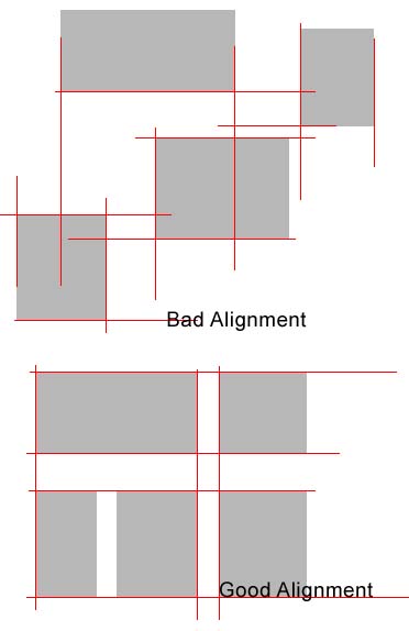
Added: Step 5 – Watch your alignment
Here is something I picked up from reading a great, very simple book about design, Robin William’s (no, not that one) The Non-Designer’s Design & Type Books.This is a great start for anyone without design experience that either want to get their feet wet in what design means or want nothing to do with design but want their documents/webpages/anything printed to look better.
She talks about a very important piece of the design puzzle: alignment. Watching your alignment means that everything on the page is lined up with something else. Why do properly-formatted outlines look so good? Each level is aligned with all the other elements at that level. Why does a well-built spreadsheet look so good? Because Excel forces your information into a grid so it is easy to read. Robin’s Principle of Alignment goes like this:
Nothing on the place should be placed on the page arbitrarily. Every item should have a visual connection with something else on the page.
This is easy in Word because it formats the text and, for the most part (ahem) keeps it pretty. If you’re putting text together in a visual program, like Photoshop, it gets a bit harder. Use guides and rulers to make sure that left text edges line up with each other and try to make sure you can draw a clear mental line from the edge of everything to something else.
Step 6 – Try something new
So your document is basically finished! It sounds great, it looks great, it’s the whole enchilada. Now save it. Save it again. OK, now let’s try something fun.
Let’s play around a little bit with your headers and body text. Change your headings to a different font, maybe a serif one if your body is sans serif. Add a horizontal line after your subheadings. Try adding italics to key points for emphasis or bold weight to key sentences (go easy). Try placing relevant icons to headings or specific paragraphs (free, high-quality icons can be found here, at IconArchive.com). Use indentation to move the main text inwards or try moving your subheadings more towards the center. Play around with centering and right-aligning different page elements.
![]()
Most often, the times when I found something that worked really well in a document were when I was just messing around. It would usually look terrible after the first 5 changes and then I would do something different and come up with an idea. After a while of messing around with the text formatting and changing some of the existing styles, I would end up with a unique look that I really liked.

Another technique is to just leave it alone for a day. Try something new, save it as a different file name, then come back to it the next day. You may like it more, less or not at all. You also might come up with another little tweak to go along with your first one that really ties things together. Give it time, let it marinate, and you may just end up with something you can be really excited about.
Step 7 – Follow the rules
For the detail-orientated, I’ll direct you to a great list of typography rules to follow. There are quite a few of them but if you want that professional look, you would be wise to glance through and make sure you’re not including some glaring errors. The list was be found here, at About.com.
< Take Action >
Comment via:
Subscribe via:
< Read More >
Tags
Newer

Jul 29, 2008
Random design inspiration post #1 - Currency
Pull a bill out and look at it really close. The detail is impressive and the layout is very interesting, particularly because it has a lot of limitations/requirements.
Older
Jul 21, 2008
Blogging 101: How to Write a Great Blog Post... a Reader's Perspective
By posting a great piece of advice or a guide for someone or your professional insight, you contribute to the incredible equalizing power of the internet.