Building a homepage from a blog: Part 2: Finalizing the design and planning out mark-up and CSS structure.
Last time we left off, I had put together a structure of what I wanted my website to display and what it might look like. After about weeks of stressing out in Illustrator, I finally decided on a design I like.

A now-defunct article, mentioned in the previous post, speaks to a high quality design and says that the following elements should be present for a design to be considered “high-quality:” balance, unity, emphasis, contrast, and rhythm.
I’m new to all of this… how can this article help me?
Welcome to the new format of all of my blog posts (news items and quick ones not included). I’m worried that I might be struggling in a vacant gray area between the “knows” and the “know nots.” This blog is specifically for people who are just starting to explore what technology can do for them and their business. As such, I want to position everything that I write to face towards the novice, not the expert. I feel like a perpetual novice, always learning, and when I share that knowledge, I feel like I know it better in the end.
So, what does this article do for the novice? You’re either someone exploring web design for the first time, a web coder or developer who is trying to improve their design skills, or a complete web novice who wants to come up with a picture of what their business or personal site should look like. Whatever your situation, you want a web site that looks good, does what it should, and isn’t too hard to maintain. I strive as much as possible to build with those goals in mind.
This article walks through some basic aspects of design and shows you how I used them to create a picture of what my site will look like when it is finished. I used to this “design language” and “core elements” were just a bunch of fancy words people used to look smart. I was surprised when I actually took the time to understand them and practice them and found that my designs improved drastically. I want to help explain these concepts to you, show you how they work, and give a few resources where you can read even more.
My web site design in words
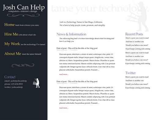
Balance … the headings (like “Home,” “Hire Me,” etc. as well as “Contact” and “News & Information”), logo (“Josh Can Help”), light header text (the “tame your technology” at the top), and lion tamer icon all provide the “heavy” while the rest of the text provides the “light.” It’s the interaction and distribution of heavy and light that make appropriate balance.
Balance can be used in several different graphic design elements… Creative Curio explains
Unity … All my freelance-related elements (yellow text) are grouped together on the right and all of the blog content on the left. Also, navigation elements are together, blog sidebar functions are together, and the posts are formatted similarly to come together as one. Groups of objects allows for macro white-space and makes finding the information you need much easier.
A List Apart speaks about white space (excellent article)
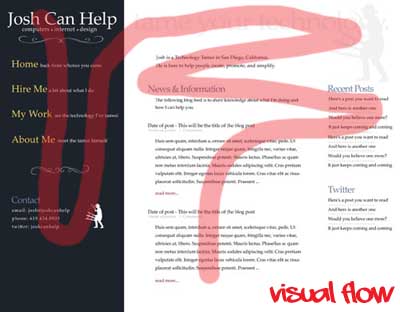
Emphasis … The left sidebar is prominent and draws the eyes through the navigation down to the tamer icon at the bottom. On the right, the headlines grab the attention subtly. Though the emphasis in this final design is how I want it, it’s the flow from focus point to focus point that is the most difficult. You want to provide a bold visual element to attract a visitor’s attention and then lead their eyes through the elements you want them to see. I’m not sure if I’m doing that appropriately but it should not be too hard to fix ex post facto.
Contrast … There is the obvious contrast of the left sidebar with the white space on the right. There’s also contrast within the sidebar with the colored navigation items along with the logo at the top. In the white space to the right, the black text on white background is the ultimate contrast. I would like to use a bit more exciting colors but it seems like the more vibrant they become, the more I lose the already minimal vintage feeling the website has. I may need to play with this.
A List Apart (again) with a very in-depth look at contrast. It’s a lot to understand but important.
Rhythm … the blog posts are formatted similarly and the blog widgets on the right will have similar formatting between them. The navigation items also have a rhythm between them. I see visual rhythm in a similar way that I see unity. Each of the different elements should roll from one to the other within the group. As soon as the
Here are a few of the highlights:

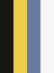
>>> I had a little bit of fun with the colors without going overboard. As you can see, there aren’t a lot of colors and the ones that are there are not particularly bright. I’m a big fan of very colorful artwork but I save my own exploration of this for my graffiti. My audience and my potential customers are typically over thirty (possibly far over thitry) and probably wouldn’t have the best reaction to a busy, extravagant design. My own design style concentrates on typography, cleanliness, and simplicity and I think this page reflects that.

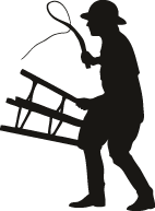
>>> One recurring theme you see on the site and in my business in general is the lion tamer silhouette. I really like this symbol and want to use it as one of the few shapes I’m using on the site. You can also see I’m playing with some of the vector decorations that frame my business card. These two elements lend a slightly vintage feeling to the design while keeping it from feeling stuffy.

>>> The emphasis is clearly on the information to the left of the screen. This is (in order) a description of the work I do, a summary of the work I’ve done, and a blurb about me and what I’m all about. The next element are the blog posts which are secondary to the information you need to hire me for your projects. Finally, if you’re interested in reading more on my blog, there is the typical sidebar with information, ads, and more widget fun.
Here’s what might change:
+++ The description in the center might be different or look different. I don’t want it to compete with the “Josh Can Help” logo but it should draw the eye back up from the left sidebar.
+++ The left sidebar color may change. I’ve tried many different ones and I think I like the current one best but I’m not sure.
+++ The menu item descriptions may fall below the main text or appear when the mouse hovers over… not sure yet.
What’s next?
Complete and total destruction. I’m taking the default WordPress theme, stripping it bare, and building back up into something wonderful. I’ll give an overview of what I’m doing and why but I don’t want to get into the nitty-gritty code details because it might be a bit too high-level (la-tee-da).
< Take Action >
Comment via:
Subscribe via:
< Read More >
Tags
Newer
Aug 23, 2008
Josh Can Help updates...
I meant to use this blog as a place to update information about my business and maybe some relevant personal stuff but I’m so boring that all I write about is work and coding!
Older
Aug 11, 2008
Did your website or blog just crash suddenly? You might have a problem with your permissions...
Just recently, all the pages hosted on my account began to fall apart. I was getting 403 errors, missing graphics and styles, and pieces of code appearing randomly. It looked about as bad as it could get.