I’m always looking for a bit of inspiration, be it color schemes or layouts, and currency provides both.
Pull a bill out of your wallet (if you have one) and look at it really close. The detail is impressive and the layout is very interesting, particularly because it has a lot of limitations/requirements. Currency is very ornate and acts as a representative of the country at large. Cash is like a language: it speaks volumes at home and is typically useless abroad.
I found a few bills that I had been using as decoration and scanned them into my computer (fairly low resolution… is that still illegal?). I put the back and front together, then zoomed in and sampled colors that were representative of that bill. Those are the vertical brush strokes at the bottom. Then, I found a very contrasting color somewhere in the image and cut that across the middle. The result is interesting, to say the least.

This Indian Rupee has a great combination of purple, light blue/turquoise and a little bit of pink/orange. In person, the colors look almost iridescent. The window is a watermark of a person (someone important I assume). I see an interesting 3 column design buried in there (portfolio?):

Falls under the ever-popular retro category for sure. Calm the ornateness down a bit and cut back on a few colors and that could be a very successful one-page design.

The colors on this one are some of my favorites. The right 4 on the pallet above combined with the pink is very vibrant and appealing. The back of the bill is slightly reminiscent of an American dollar with the building in the middle and the decorations around it. Whatever is extending out underneath the “1” on the back is a super-superb mesh-type design. For some reason, I really like these symbols from the front of the bill:

Next up…Argentinian:

This one looks really royal and ancient, like it has some Greek influence. Photoshop helped me bring out some great colors on the back because this one is really faded out. The front of the bill has a great layout that I’m struggling to figure out a use for.. maybe a business card? With a cartoon avatar? Maybe a classy handout for a photography or art exhibit? That italic font combined with the small caps on the front is also a great feature of this one.

I like this one particularly because of its bold colors. Like the bill before, the vibrant orange in this one was brought out a bit in Photoshop. The layout is the familiar one from our own currency. I’m really feeling that font on the front though I can imagine that its usage is pretty sensitive (easy to use in the wrong spot or overuse it). There is a lot to see on this one because it’s a big bigger than the other ones (lengthwise). Great decorations surrounding the bust:

I took the end pieces, got rid of the surrounding pixels, rotated, and made a mirror image. Try making that little guy into a pattern… very “oriental rug” style.

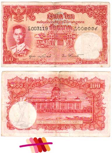
Another note from Thailand with a really different color scheme. The two colors on the far right, the dark maroon/purple and the light yellow are a particularly nice combination; I can imagine those being used in a room or something. Lighten up the light colors and I could see this pallet used on, say, an upscale art gallery site or on a nice restaurant menu.
There were quiet a few shapes in this one that I like but, in particular, the corners on the front. The corner of this corner piece looks like an arrow, a shape I’m fond of for no discernible reason.
One more from the same country…
This one really strikes me because of just how ornate it is. The color pallet appears to be very limited but, zoomed in, there is a lot to see. The decoration is completely over-the-top but, because it’s cash, it’s allowed to be garish and distracting.
It might be hard, at first, to see where any usable inspiration could come out of this but it all lies in the details. I found the winged creature in the top left on the front very appealing; tone down the detail and stylize it and you could have a great crest for a logo. There are also several patterns in the framing that could be used, maybe in a more subdued color, as a background.
Finally, one of my favorites…
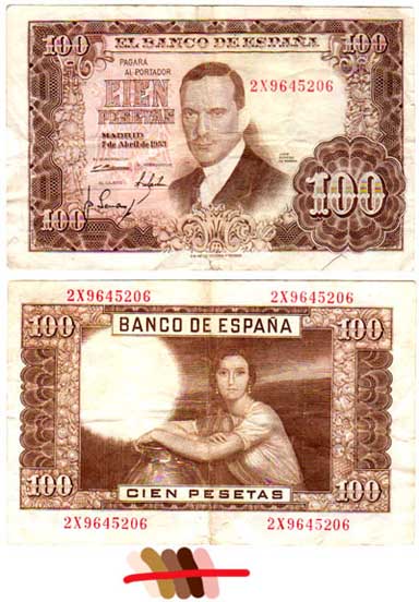
I got these bills a long time ago (15 years, maybe) from my grandpa and I never really liked this one in the beginning. They got put away for many years and just recently pulled out and this one jumped out as being so unique. Look at the guy on the front, how 50’s Hollywood is that image? The brown color is great (better in person) and the composition as whole feels, to me, very theatrical. The font for the “100” is perfect and has this old west feeling to it. It’s also very creative how they incorporated the watermark spot into the unused portions of both portraits.
Hope you enjoyed that; I thought it was great to pull this apart a bit and really get up close and personal. I wish I could scan these with more detail but, well, that’s probably not a good idea.
< Take Action >
Comment via:
Subscribe via:
< Read More >
Tags
Newer
Aug 04, 2008
Graffiti art evolution: from drawing to painting to vector; moving your art into a new market
If you paint pictures, you can design shirts. If you draw cartoons, you can easily translate that to digital images for web sites or blogs. Find the niche, spread the word, and extent your influence.
Older
Jul 23, 2008
6 steps to easy typography in any document
This small primer serves as either an introduction to typography or all the information you’ll ever need to know as a non-designer.